Also called a scatter plot, XY graph or a scatter graph, an XY plot displays values for variables using dots on a grid. An XY graph template in your presentation can show a pattern or a relationship across a set of multiple data points. They are often used to discuss data in business presentations, such as revenue, sales, profit and losses, and so on.
Use the XY plot template to:
- Predict future trends
- Spot patterns in customer or audience behavior
- Display changes over time
Pro Tips for using an XY Plot Template
Here are a few things to consider when using an XY graph template.


XY plots are perfect for lots of data.
Since each data point only takes up one small dot on the grid, XY plots are perfect for plotting a high number of data points.
Don’t use an XY graph to show increases or decreases.
While an XY graph is great for displaying trends and patterns, it’s not as accurate when showing increases and decreases from one data point to another.
Add a trend line.
If your data has a clear positive or negative relationship, add a trend line to your data to make it more visible.
Be creative.
Play around with the colors of your data point dots, your grid, trend line, or labels. The more visually compelling you can make it, the better your audience will be able to interpret it.

NEW LAYOUTS IN SECONDS
Switch between XY plot, quadrants, and bubble layouts in just one click.
EMPHASIZE KEY POINTS WITH CUSTOM CALL OUTS.
Customize your slide with text boxes, shapes, and images. Move them wherever you want on your slide.
More Popular Templates
With Beautiful.ai, getting started comes naturally. 60+ smart slide templates guide you and suggest ideas along the way, so you never have to face a blank page.

Customer Journey Map Template Slide

Desktop

About Us Slide
Agenda Slide
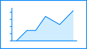
Area Chart
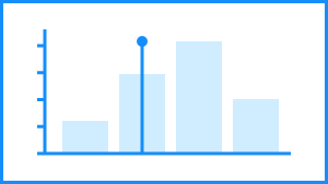
Bar Graph